
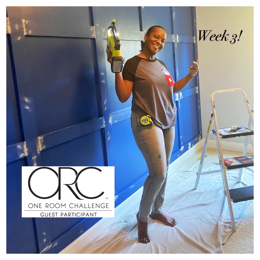
Welcome to Week 3 of the One Room Challenge! Last week I revealed the design plan for the office and this week we are in full swing into executing the plan. If you follow me on Instagram, you might have seen the warrior in me this weekend when I did the board and batten grid pattern as the feature wall. You can check my highlights here for the process.
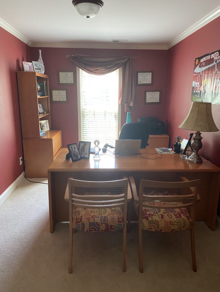
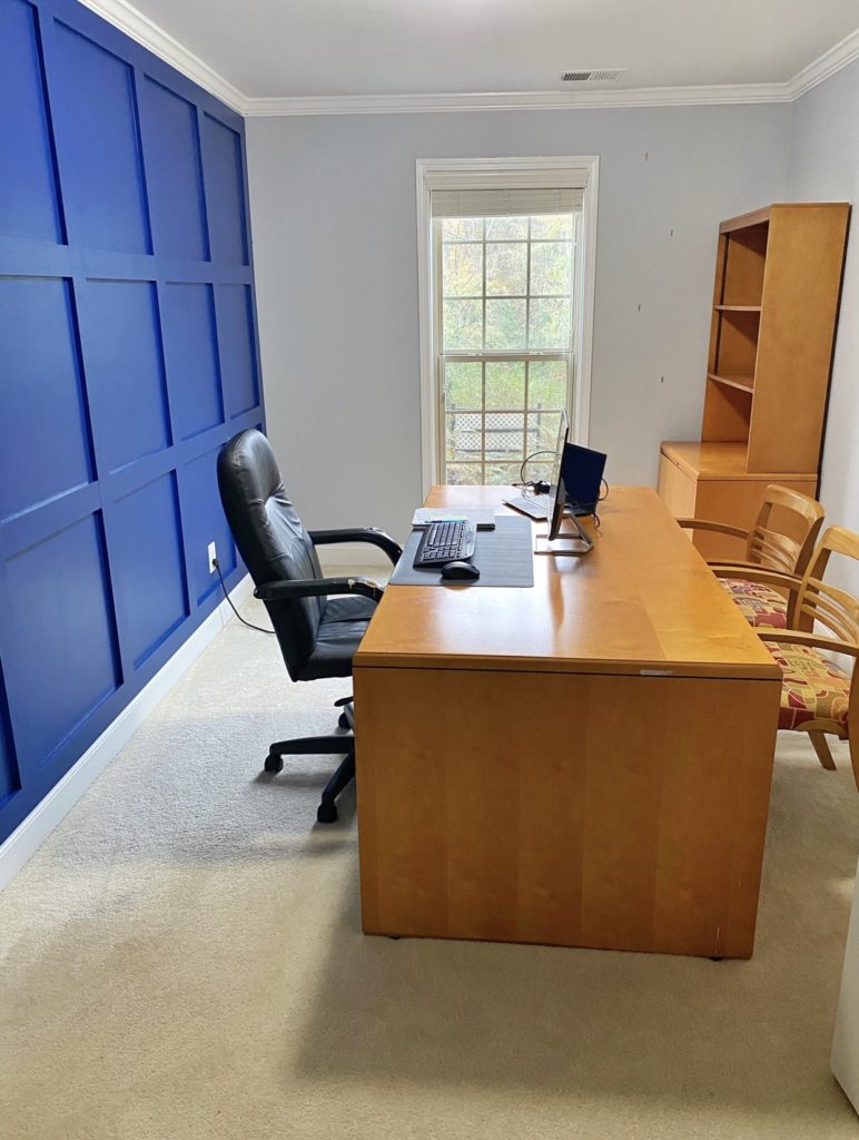
Whoa!! Just take a look at the office transformation so far! What an improvement to the space already?! The before and after is like night and day! I am so loving the Sherwin Williams Indigo (SW 6531) paint selection for the accent wall and the complimentary Gray Screen (SW 7071) paint for the other walls. Adding a bold backdrop to a room brings loads of charm and personality. As I mentioned last week, I want the room to reflect my husband’s style and personality. And boy does he deserve it!
Now, let’s talk about the power of paint. Paint is my secret weapon, fabric too but for now, we will focus on paint and leave fabric for another discussion. Color is a powerful tool and the colors in your home should not be ignored. Over time our taste and style evolve and change. The colors and style we loved 10 years ago no longer suits us. It’s however not always in the budget or practical to throw out everything that we have and start over from scratch. Changing the paint color in your home is one of the things that you can do to provide a stunning transformation that costs only pennies compared to other renovations! It can also have a big impact on your psyche (your soul, mind or spirit).
Let’s face it, picking the right paint color can be difficult and hard. Some people spend hours trying to select the right color and shade or give up trying. Yes, this process can be very overwhelming to say the least. To ensure success for your next project, I have a few tips that I’d like you to consider that will make picking the right color a breeze.
- Take an inventory of the fixtures and furnishings that you consider permanent in your room. Certain furniture pieces and flooring for example can be costly to change, so you might consider keeping them to save money. Take it from the accountant, create a budget and look for ways to save money in areas where you don’t need to spend so that you have more to put into other areas. Then, draw your inspiration from what you plan to keep and figure out which shades of paint will compliment them. You can even pull a color from your artwork or other accents. In my case, I chose Indigo as my paint color because it goes well with the existing office furniture which I am keeping. You can read week 2 blog here for the background story on why I chose to keep the existing furniture.
- Determine if you want a variety of colors or if you prefer a monochromatic scheme with different shades of the same color. You should consider if there is a certain mood you’d like. For the office, I wanted the color to be bold to reflect my husband’s personality, but not too bold so I softened it with the Gray Screen paint color. Let’s say you plan to redo a bathroom, you may want a relaxing or spa like vibe so softer shades of color may work better to achieve that.
- Always remember to factor in the light source in the room. Natural light will make a color look different depending on the time of day. Interior lighting should also be considered especially as it gets dark and you rely on the indoor light. Natural versus interior lighting can have a different look on the same color. The different undertones of the color will show through depending on the lighting, so it’s important to try a few swatches of paint and observe a sample on your wall during the day, in the evening and at night when it’s really dark and you have to turn on your lighting. The color of your bulbs will also play a role on the appearance of your color choice. There are three primary types of color temperature for light bulbs; soft white, bright white and daylight. You may need to update your lights as well depending on the look and feel you are going for.
- The different paint finishes can affect the appearance of your paint selection on your wall as well. Paint can be mixed in a variety of finishes such as, flat, gloss, semi-gloss, eggshell, satin, and more. Glossy finishes for example are usually used to highlight an architectural feature so that it stands out (wood trims, cabinets and doors) and it’s usually stain resistant. I chose a semi-gloss finish for the Indigo paint color because I knew I’d be doing a board and batten accent feature and it would brighten the space and make the trim work stand out. If you’re not certain about the right sheen for your project, I suggest talking to your local paint expert who knows a lot more about paint sheen and the durability. Just don’t ignore it because it will show your paint color choice differently on the wall.
After considering your existing furnishings, mood, lighting and paint sheens, collect your color inspiration. Get a few paint samples and either try them on your wall or paint it on a white sheet of paper to hang on your wall. If it’s not immediately clear which color is the winner, leave it on for a few days and the true winner will jump out at you. You can determine at that point if you need to lighten the color or go darker. If it turns out as you’ve envisioned, go for it and paint your room!
There is no right or wrong color. Much of this is your personal preference which is usually based on your lifestyle and existing furnishings. Don’t be afraid to step outside of your comfort zone and try a bold color or combination of colors. This is your home, it should be a reflection of you and you know you best.
I have a few more DIYs to complete. It includes painting and reupholstering 2 side chairs, sewing a faux roman shade for the window, repaint the french doors, repair a damaged section of the desk and build a floating frame. Eeek! Stay tuned to Instagram as I share the progress and the results here on the blog next week. I am excited and can’t wait to see it all come together!
Be sure to check out the progress of the other guest participants and featured designers! There are some amazing projects going on and so much inspiration!
Great work. Love it. Looking forward to the next blog and can’t wait to see the finished room.
Thank you so much! We’re half way there so stay tuned!